7 Handwriting Ideas for Projects
First impressions matter, and your project’s handwriting often creates that impression before anyone reads the content. Neat, attractive lettering makes a cover page feel intentional rather than rushed. It also improves readability, which helps teachers follow your ideas without straining over messy words.
Presentation and grades tend to go hand in hand more than students expect. A project with clear headings, consistent spacing, and thoughtful lettering signals genuine effort at a glance. Below are seven handwriting ideas designed to help your school or college project stand out for the right reasons.
1. Elegant Calligraphy Titles
Elegant calligraphy gives project titles a graceful, refined appearance through natural thick and thin stroke contrast. Downstrokes appear bold, while upstrokes stay delicate, creating visual rhythm within each letter. This style suits formal subjects that benefit from a polished, traditional tone.
History assignments, literature reports, and language projects all pair beautifully with calligraphy titles. The elegant flow immediately signals a thoughtful, well-prepared piece of work. That said, it can feel mismatched on technical subjects like mathematics or coding, where simpler lettering communicates ideas more clearly.
New learners should master basic pressure control before writing a complete title. Press firmly while moving downward, then ease off pressure on the way up. A flexible brush pen offers the most forgiving control for someone just starting out.
Rich colors like navy, deep maroon, or charcoal complement calligraphy without appearing overly casual. These shades keep the style looking formal rather than playful. Steer clear of neon or overly bright inks, since they clash with calligraphy’s classic character.
A frequent mistake involves writing too quickly, which erases the contrast between thick and thin strokes entirely. Slow, deliberate movements protect that signature elegance. Add a small flourish beneath the final letter, or a subtle underline, to personalize the title further.
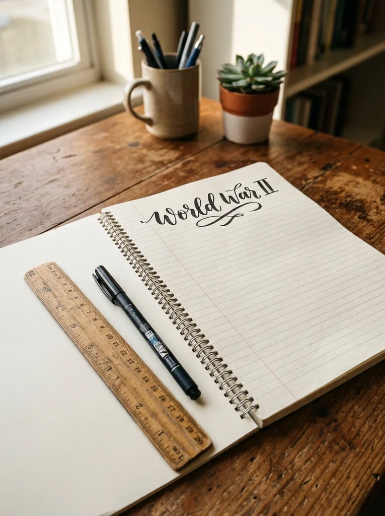
Sample Project Heading
For a title like “World War II,” let the W stretch with a graceful curve while the numerals stay compact and refined. This balance keeps the heading elegant without looking overdone.
2. Bold Block Letter Headings
Bold block letters bring structure and immediate clarity to any heading. Every stroke stays straight and evenly weighted, which makes titles easy to read even from a distance. This style suits technical subjects where precision matters more than decoration.
Science reports, engineering assignments, and computer studies projects benefit greatly from block lettering. The clean, geometric shapes mirror the logical nature of these topics well. Diagrams and labeled illustrations also look sharper when paired with simple, structured block letters.
Beginners should sketch light pencil guidelines first to keep letter height even throughout. A ruler supports consistent spacing between each character as you write. Fineliners or medium-tip gel pens produce the crisp edges this style depends on.
Deep navy, black, or forest green suit block letters particularly well, keeping headings sharp and professional. These tones avoid distracting from surrounding diagrams or text. Skip soft pastel shades here, since they weaken the bold, structured feel block lettering relies on.
A common slip-up is letting letter width shift unevenly across a word. Careful spacing keeps the entire heading visually balanced. Try adding a thin colored border around each letter, or a subtle shadow, to give block headings extra personality.
Sample Project Heading
For “Human Digestive System,” keep every letter identical in height and width throughout. Slightly thicker strokes on capital letters give the heading a confident, sturdy presence.

3. Bubble Letter Project Covers
Bubble letters bring a cheerful, rounded quality to project covers and titles. Each character looks slightly inflated, almost like a soft balloon shape, giving headings a friendly, approachable feel. This style suits younger students and creative subjects that welcome a playful tone.
Art projects, environmental studies, and creative writing covers all shine with bubble lettering. Younger students especially enjoy the colorful, rounded look this style brings to their work. Formal college assignments, however, usually call for something more restrained instead.
Beginners should lightly sketch letters in pencil before tracing over them with marker. Rounding off every corner, even naturally straight ones, keeps the bubbly effect consistent throughout. Broader markers help fill each letter’s center evenly without patchy gaps.
Bright shades like coral, turquoise, and sunny yellow bring bubble letters to life on the page. These lively colors match the fun, energetic tone this style naturally carries. Dark, muted tones tend to clash with the cheerful spirit bubble lettering is meant to express.
A frequent error is drawing outlines too thin, which flattens the rounded, puffy look entirely. Keep outlines thick and evenly shaped from start to finish. Small doodles or polka dots tucked inside each letter add a fun, personal touch.
Sample Project Heading
For “Plant Cell,” round every letter generously and shade the inside gently for a soft, dimensional look. This works especially well for a lively science cover page.

4. Minimalist Print Handwriting
Minimalist print handwriting strips away decoration in favor of clean, consistent lettering. Every letter maintains the same height, with even spacing carried throughout each line. This style suits formal reports and assignments where clarity outweighs visual flair.
College papers, research summaries, and formal presentations all benefit from minimalist print’s simplicity. Long paragraphs stay easy to follow without unnecessary visual clutter distracting the reader. It’s also the safest choice when a project needs to feel serious and well organized.
Beginners should prioritize consistent letter height over writing speed at first. Faint guideline dots help maintain that uniformity line after line. A fineliner with a thin tip, around 0.3mm or 0.4mm, produces the crisp strokes this style requires.
Charcoal gray or black ink keeps minimalist print looking sharp and professional throughout a project. One accent color reserved for headings adds subtle interest without overwhelming the page. Avoid using more than two colors total, since restraint defines this entire style.
A common misstep is adding decorative flourishes, which undermines the clean simplicity minimalist print depends on. Keep every letter plain and evenly structured instead. A slight natural slant, unique to your handwriting, personalizes this style without breaking its minimalist rules.
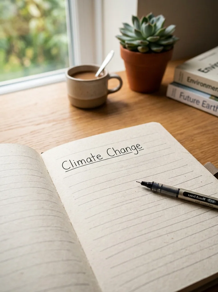
Sample Project Heading
For “Climate Change,” keep letters evenly spaced and matched in height throughout. A single thin underline beneath the heading adds subtle structure without disrupting the minimalist feel.
5. Brush Pen Lettering
Brush pen lettering creates bold, expressive headings using dramatic thick and thin stroke contrast. This style feels energetic and modern, carrying more movement than standard print or calligraphy. It suits creative subjects and presentations where visual impact truly matters.
Art portfolios, creative writing projects, and presentation title slides all benefit from brush lettering’s bold energy. The dramatic contrast grabs attention immediately, making a strong first impression on any cover page. Dense, text-heavy pages, however, usually call for simpler lettering instead.
New learners should practice pressure control with basic strokes before attempting complete words. Press down firmly while moving downward, then lighten your grip on the way back up. Soft, flexible-tip brush pens give beginners the most predictable, forgiving control.
Rich shades like deep teal, burgundy, or plum look striking against brush lettering’s bold contrast. These tones enhance the style’s dramatic feel without overwhelming the surrounding page. Pale pastels tend to wash out, weakening the strong visual impact brush lettering aims for.
A common issue is applying steady, even pressure throughout, which erases the stroke contrast entirely. Gradual pressure shifts, rather than sudden changes, keep the effect convincing. Blending two ink colors within a single word creates a soft, eye-catching gradient effect.
Sample Project Heading
For “Artificial Intelligence,” let downstrokes appear noticeably bold while upstrokes stay light and thin throughout. This contrast suits a modern, technology-focused project perfectly.

6. Decorative Doodle Lettering
Decorative doodle lettering pairs simple letters with small illustrations woven around or inside each shape. This playful style suits creative subjects and younger students who enjoy adding personality to their pages. It turns an otherwise plain heading into a small, thoughtful piece of art.
Biology projects, environmental studies, and creative writing covers all work well with doodle lettering. Small icons like leaves, waves, or symbols tied to the topic reinforce the subject visually and memorably. Dense, text-heavy pages, though, work better with simpler lettering reserved for titles alone.
Beginners should sketch base letters first, then layer doodles once the lettering feels balanced overall. Fineliners handle clean outlines well, while gel pens add color and finer details afterward. Simple doodles work best at first, since intricate designs can overwhelm new learners quickly.
Soft greens, sky blues, and warm yellows suit doodle lettering tied to nature or science themes especially well. Choosing colors connected to your subject creates a cohesive, intentional look overall. Clashing bright colors tend to compete with doodles rather than support them.
A frequent mistake is decorating every single letter, which clutters the heading and hurts readability. Two or three accented letters usually strike the right creative balance instead. Icons directly related to your project topic personalize this style in a smart, memorable way.
Sample Project Heading
For “Water Cycle,” surround the lettering with small doodles like clouds, raindrops, or gentle waves. Keeping the base letters simple lets the doodles enhance the heading rather than overwhelm it.

7. Shadow Letter Titles
Shadow lettering creates a striking three-dimensional illusion by placing a darker offset shadow behind each letter. This bold, graphic style makes titles pop with genuine visual depth. It suits modern subjects like business, technology, and any presentation that needs a confident, eye-catching heading.
Cover pages and presentation slides for technology or business topics benefit greatly from shadow lettering’s bold structure. The three-dimensional effect creates a strong first impression right from the opening page. Long stretches of body text, however, work better with simpler, flatter lettering instead.
Beginners should start with basic block letters before layering in shadow details afterward. Trace a slightly offset outline behind each letter, usually toward the bottom right corner, then fill it in solidly. Fineliners and dual-tip markers keep those shadow lines crisp and precise.
Gray, deep navy, or dark red shadows pair beautifully with bold black or colored base letters. Keeping shadow direction consistent across every letter preserves the three-dimensional illusion convincingly. Randomly mixed shadow colors, though, quickly break that carefully built visual effect.
A common error is angling shadows inconsistently, which ruins the sense of depth entirely. Every shadow should point the same direction throughout the heading. Colored shadows, instead of standard gray or black, add a fresh, modern twist worth trying.
Sample Project Heading
For “Solar Energy Project,” write bold block letters with a consistent shadow offset toward the bottom right corner. This gives the title a confident, dimensional look suited to a science or technology theme.

Comparison Table of Project Handwriting Styles
| Handwriting Style | Difficulty | Best Project Type | Recommended Pen | Beginner Friendly |
|---|---|---|---|---|
| Elegant Calligraphy | Moderate | History, literature | Brush pen | Yes |
| Bold Block Letters | Easy | Science, technical reports | Fineliner | Yes |
| Bubble Letters | Easy | Art, creative covers | Marker | Yes |
| Minimalist Print | Easy | College assignments | Fineliner | Yes |
| Brush Pen Lettering | Moderate | Creative, presentations | Brush pen | Yes |
| Decorative Doodle | Easy | Biology, environmental | Fineliner, gel pen | Yes |
| Shadow Letters | Moderate | Business, technology | Fineliner, marker | Yes |
Essential Supplies for Beautiful Project Handwriting
Choosing the right supplies makes every handwriting style far easier to execute well. Fineliners provide the precision needed for block letters, minimalist print, and clean outlines. Gel pens glide smoothly, making them ideal for decorative accents and small doodle details.
Brush pens remain essential for calligraphy and brush lettering, since their flexible tips create natural thick-thin contrast. Fountain pens add elegance to formal titles, though they need smoother paper to avoid feathering or bleeding. Colored markers handle bubble letters and shadow effects particularly well on bold cover pages.
Keep pencils and erasers nearby for sketching headings before committing to permanent ink. This simple habit prevents visible mistakes on your finished page. A ruler helps maintain straight guidelines, even spacing, and clean margins throughout the entire project.
Choose premium notebooks or smooth paper to prevent ink bleed, especially with brush or fountain pens. Smooth surfaces also help shading and blending look neater overall. Finally, keep correction tape handy for quick, tidy fixes instead of messy scratch-outs.
How to Make Your Project Handwriting Look Professional
Consistent spacing between letters and words instantly makes any handwriting style look more polished. Uneven gaps distract readers, even when individual letters look attractive on their own. Practice spacing separately from letterforms until it feels natural.
Alignment matters just as much as spacing throughout a project. Keep headings centered or consistently left-aligned rather than switching styles halfway through. Clean margins on every page also give your work an organized, professional appearance.
Letter consistency ties every page together visually from cover to conclusion. Practice your chosen style on scratch paper before writing directly onto your final project. This small step prevents shaky, uneven letters from appearing on finished work.
Color balance deserves careful thought too. Stick to two or three colors throughout the entire project for a cohesive, intentional look. Establish a clear heading hierarchy, using bolder lettering for main titles and simpler print for subheadings beneath them.
Always test your pen and style on scratch paper before writing your final heading. This habit avoids smudges, mistakes, and wasted pages during the process. Choose pens suited to your paper type, since certain inks bleed through thinner sheets and ruin neat work.
Finally, keep overall page organization tidy by leaving consistent white space around headings and images. Crowded pages feel messy regardless of how nice individual letters appear. Pro tip: step back and view your page from a distance occasionally to check its overall visual balance.
Frequently Asked Questions
Which handwriting style is best for school projects?
Minimalist print and bold block letters generally work best, since both prioritize clarity and readability across most subjects. These styles suit everything from science reports to literature assignments without appearing too casual. For creative subjects, bubble letters or doodle lettering add personality while still staying easy to read.
How can I make my project look attractive?
Focus on consistent spacing, clean margins, and a clear heading hierarchy throughout every page. Choosing one or two handwriting styles for titles, while keeping body text simple, creates helpful visual contrast. Adding subtle color accents or small doodles tied to your topic enhances appeal without overwhelming the content.
What pens should I use for project writing?
Fineliners work best for clean, readable body text and structured headings throughout a project. Brush pens suit decorative titles that need bold, expressive contrast on cover pages. Gel pens add nice color accents, while fountain pens elevate formal titles when paired with smooth, quality paper.
Should project titles be written differently?
Yes, titles usually benefit from a bolder or more decorative style compared to regular body text. This contrast helps titles stand out and naturally guides the reader’s eye through the project. Keeping body text simple, while reserving decoration for headings, maintains a clean overall balance.
Can beginners learn decorative handwriting?
Absolutely, decorative handwriting is a learnable skill that improves steadily with consistent practice. Starting with simpler styles like bubble letters or block lettering builds confidence before attempting calligraphy or brush lettering. Practicing on scratch paper first helps beginners feel comfortable before writing on their actual project.
How do I avoid mistakes while writing a project?
Always sketch headings lightly in pencil before inking them permanently onto the page. Practicing your chosen style on scratch paper first also reduces the chance of visible errors. Keeping correction tape nearby allows for quick, clean fixes whenever small mistakes happen.
Which colours look best for project headings?
Navy blue, black, and deep green suit formal or technical projects nicely and read as professional. Brighter shades like teal, coral, or purple work well for creative or artistic subjects instead. Regardless of subject, limiting your palette to two or three colors keeps headings looking cohesive rather than chaotic.
How can I improve my handwriting for assignments?
Practice consistent letter height, spacing, and slant for around ten minutes daily. Using guideline dots or light pencil lines helps maintain uniformity while building steady muscle memory. Over time, this consistent practice naturally improves both the speed and neatness of everyday handwriting.
Final Thoughts on Elevating Your Project Handwriting
Beautiful handwriting can turn an ordinary school project into something genuinely memorable. From elegant calligraphy titles to playful doodle lettering, each style offers a distinct way to make your work stand out. Practicing consistently and matching the right style to each subject builds skills that benefit every future assignment.
Pick one handwriting idea from this list and try it on your next project today. Bookmark this guide for future assignments, share it with a classmate working on their own project, and watch your handwriting transform your work one page at a time.