
15 Hand Writing Ideas to Try Today
Handwriting still matters, even in a world full of keyboards and touchscreens. In fact, many people are returning to pen and paper because it feels personal, calming, and creative. A handwritten note carries warmth that a typed message simply can’t match.
Beyond nostalgia, practicing creative handwriting sharpens fine motor skills and boosts focus. It also gives you a unique way to express your personality on paper. Whether you journal daily, decorate planners, or just want prettier notes, these fifteen hand writing ideas will help you find a style that feels like you.
1. Modern Calligraphy
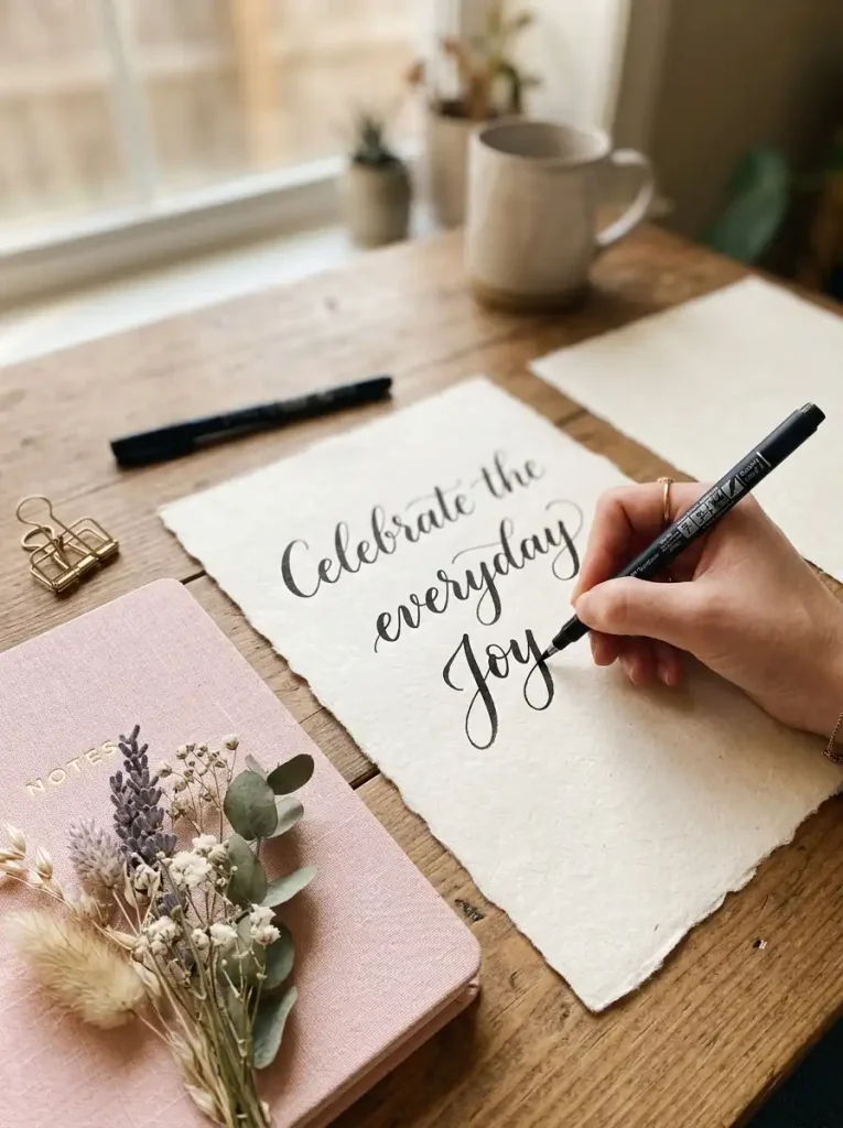
Modern calligraphy blends traditional calligraphy rules with a relaxed, personal flair. Unlike classic scripts, it allows uneven letters, playful flourishes, and creative spacing. This style works beautifully for wedding invitations, journal quotes, and social media captions.
Beginners should start with basic strokes before attempting full words. Practice thin upstrokes and thick downstrokes using light and firm pressure. A brush pen or flexible nib pen works best for creating that signature thick-thin contrast.
Common mistakes include rushing letters or pressing too hard on upstrokes. Take your time and keep practicing simple loops first. To personalize this style, add small flourishes at the end of words or experiment with slant angles that match your natural writing rhythm.
2. Bubble Letter Handwriting
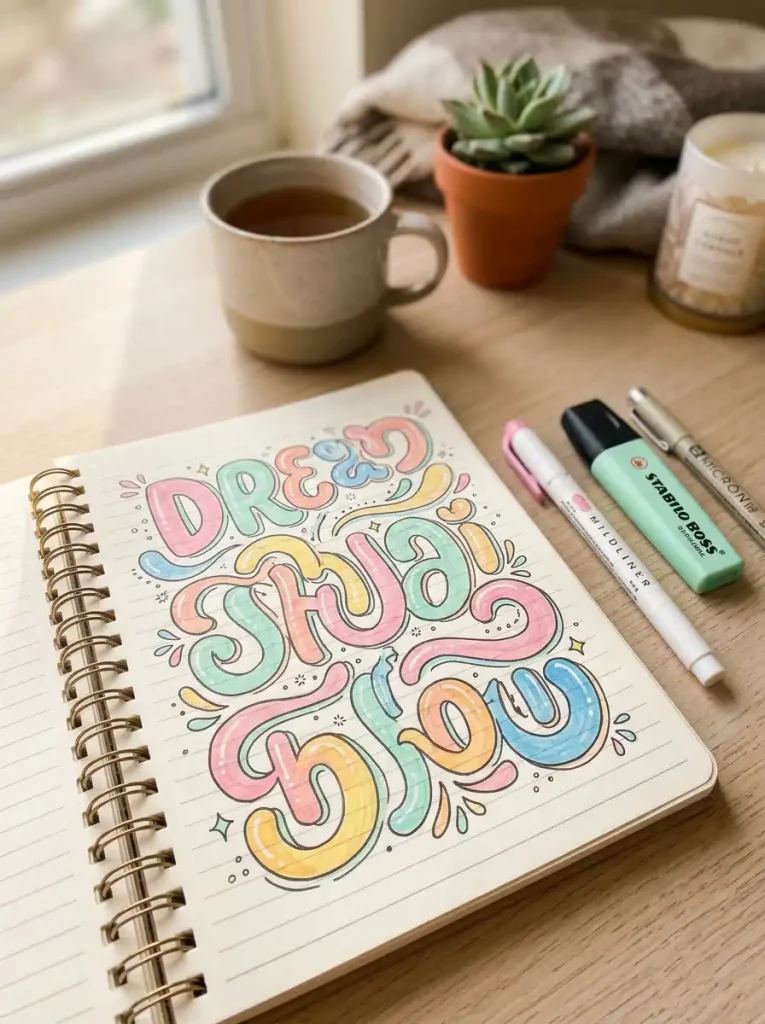
Bubble letters are rounded, puffy characters that feel fun and youthful. They’re popular in scrapbooks, posters, and doodle notes because they’re easy to color and decorate. This style works especially well for headlines and titles rather than long paragraphs.
To start, draw simple block letters first, then round out the corners into soft curves. Use a pencil for your outline, then trace over it with a fineliner or marker. Fill the inside with color, patterns, or shading for extra dimension.
A common beginner mistake is making letters too thin, which removes the bubbly effect. Keep your outlines thick and consistent. Personalize bubble letters with polka dots, stripes, or gradient coloring inside each shape.
3. Minimalist Print Style
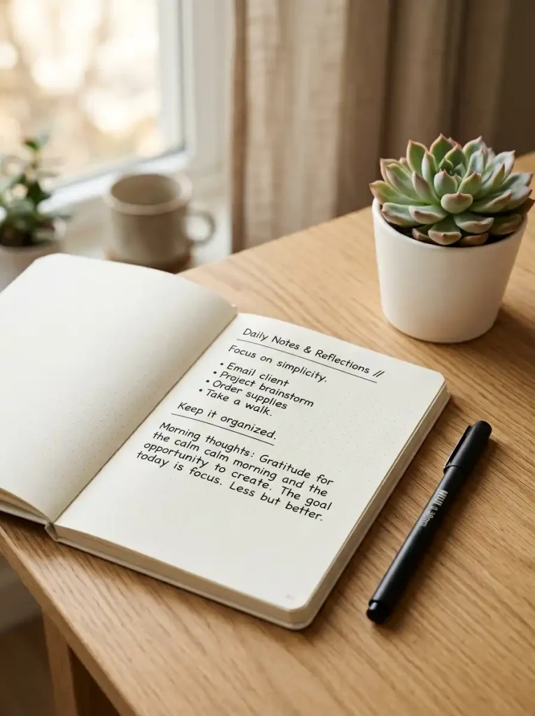
Minimalist print handwriting favors clean, simple letterforms with no extra decoration. It’s ideal for planners, to-do lists, and professional notes. This style prioritizes readability and a tidy, modern aesthetic over ornate detail.
Start by writing letters at a consistent height using light guideline dots. Keep spacing even between letters and words. A fineliner pen with a thin tip, such as 0.3mm or 0.5mm, produces the crisp lines this style needs.
Avoid mixing cursive flourishes into this style, since that breaks its clean look. Instead, personalize it through spacing choices or subtle letter slants. Many people love pairing minimalist print with pastel highlighters for organized, aesthetic planning pages.
4. Vintage Script Writing
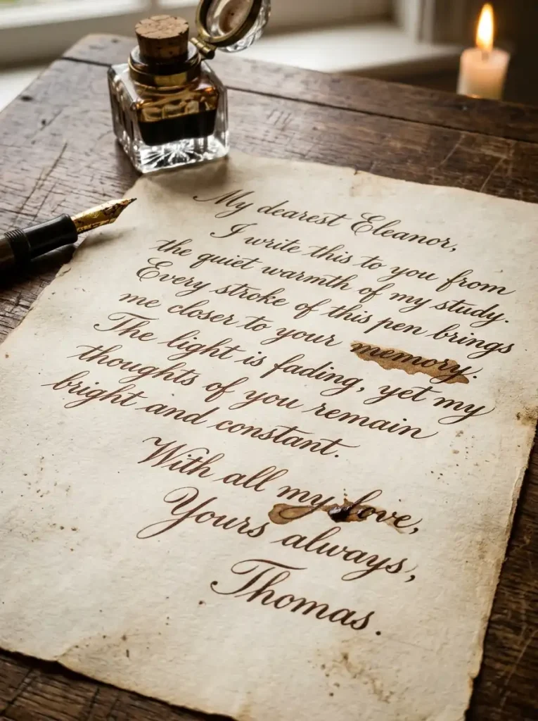
Vintage script mimics old-fashioned letters found in historical documents and antique love letters. It features elegant loops, subtle slants, and delicate connecting strokes. This style suits journal entries, quote pages, and nostalgic-themed art projects.
Beginners should study old script alphabets for inspiration before practicing. Slow down and focus on consistent slant angles throughout each word. A fountain pen with fine ink flow captures the elegant, slightly uneven charm this style is known for.
Avoid making every letter perfectly uniform, since slight variation adds authenticity. To personalize vintage script, experiment with sepia-toned ink or antique-style paper. Adding small ink blots or texture can enhance the timeless, handwritten feel even further.
5. Brush Pen Lettering
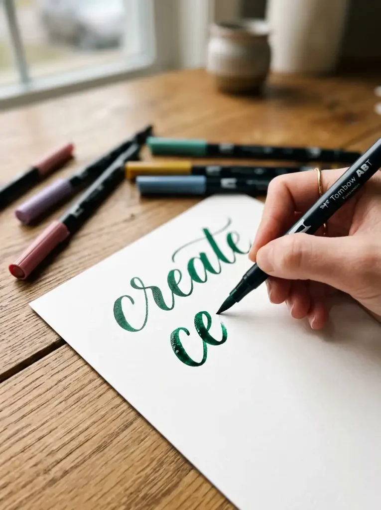
Brush pen lettering uses flexible-tip pens to create dramatic thick and thin strokes. It’s a favorite for journal titles, greeting cards, and inspirational quote art. The bold contrast makes this style instantly eye-catching.
Practice basic pressure control first, pressing down on downstrokes and lifting on upstrokes. Start with large letters before shrinking your size. Brush pens with flexible bristle or felt tips, such as small and large sizes, give the most control for beginners.
A frequent mistake is applying even pressure throughout, which flattens the contrast. Instead, focus on smooth pressure transitions. Personalize your brush lettering with color blending, using two pen colors together to create a soft gradient effect within single words.
6. Doodle Lettering
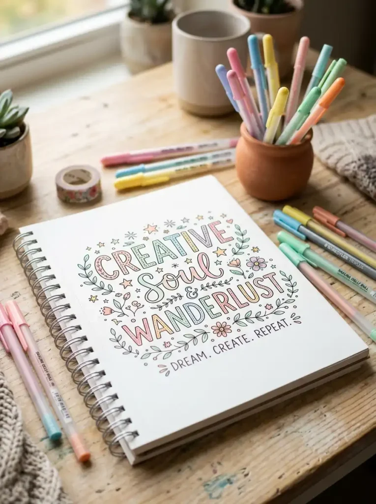
Doodle lettering combines handwriting with small illustrations woven directly into or around the letters. It works wonderfully for journal covers, planner headers, and creative notebook pages. This playful style turns simple words into mini art pieces.
Start with a basic word in bubble or block letters, then add doodles like leaves, stars, or hearts around the edges. Use fineliners for outlines and colored pens for filling in details. Keep your doodles simple at first, since intricate designs can overwhelm beginners.
Avoid cluttering every letter with decoration, which makes words hard to read. Instead, decorate only a few key letters for balance. Personalize doodle lettering with themes that match your mood, like seasonal designs or favorite hobbies.
7. Floral Letter Designs
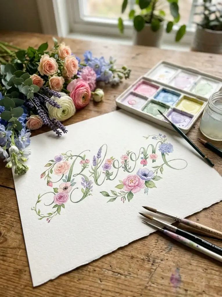
Floral lettering incorporates flowers, vines, and leaves directly into letterforms. This romantic style suits wedding decor, greeting cards, and aesthetic journal spreads. It transforms simple words into decorative art pieces perfect for framing or gifting.
Begin by writing your word in a simple script or print style as a base. Then add small flowers or vines growing from certain letters, like the top of a T or the loop of an L. Fine brush pens or watercolor markers work well for adding delicate floral details.
Avoid overcrowding every letter with flowers, since this can make words unreadable. Instead, choose two or three letters to decorate. Personalize this style using your favorite flowers, seasonal blooms, or a specific color palette that matches your project.
8. Rainbow Gradient Writing
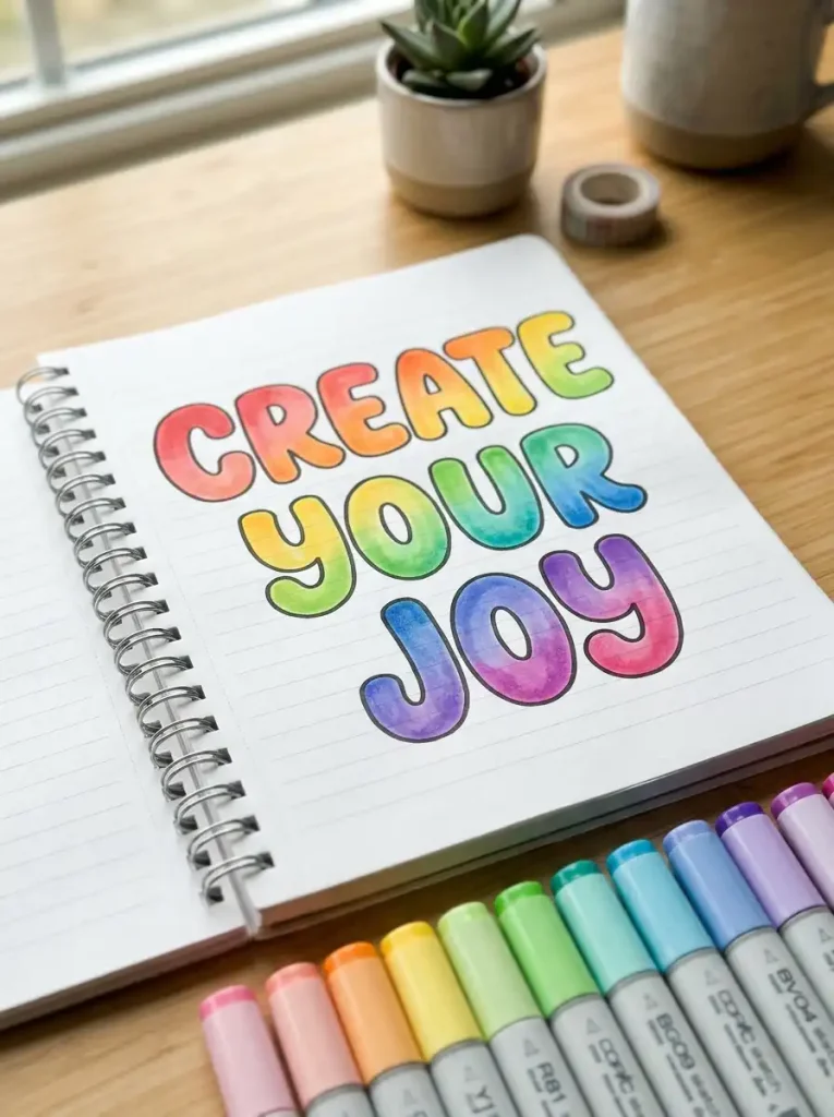
Rainbow gradient writing uses multiple colors blended smoothly within a single word or letter. It creates a vibrant, eye-catching effect that’s popular in bullet journals and creative art pages. This style instantly adds energy and personality to any page.
Start by choosing three to five colors that blend well together, like warm sunset tones or cool ocean shades. Write your word in bubble or block letters, then color each section using a gradual color transition. Blending markers or dual-tip pens make smooth transitions easier for beginners.
A common mistake is choosing too many clashing colors at once. Stick to a coordinated palette for a polished look. Personalize your gradient writing by matching colors to seasons, moods, or specific themes you’re working with.
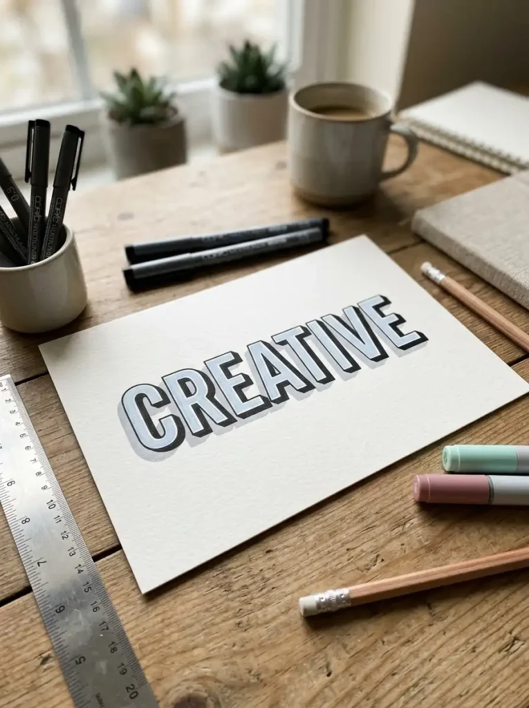
9. Shadow Lettering
Shadow lettering adds a 3D illusion by placing a darker offset shadow behind each letter. This bold, graphic style works great for planner headers, poster titles, and eye-catching journal covers. It gives flat handwriting a sense of depth and dimension.
Begin by writing your word in simple block letters. Then trace a slightly offset outline behind or beside each letter, usually to the bottom right, and fill that outline with a darker shade. Fineliners and dual-tip markers work well for keeping shadow lines crisp and clean.
See also: Active Recall Techniques: The Complete Guide to Studying Smarter
Avoid inconsistent shadow angles, since this breaks the 3D illusion. Keep every shadow pointing the same direction. Personalize shadow lettering with colored shadows instead of gray or black, which adds a fun, modern twist to the effect.
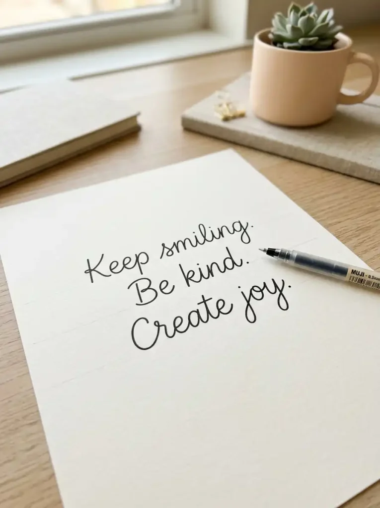
10. Monoline Handwriting
Monoline handwriting keeps every stroke the same thickness throughout, creating a clean and consistent look. It’s popular for minimalist planners, professional notes, and modern lettering art. This style feels calm, tidy, and easy to read at a glance.
Beginners should use a fineliner or gel pen with a fixed tip width to naturally maintain even lines. Focus on consistent letter height and spacing rather than pressure variation. Practicing slowly at first helps build muscle memory for steady, uniform strokes.
A frequent mistake is accidentally varying pressure, which creates unwanted thick and thin sections. Keep your hand relaxed and moving at a steady pace. Personalize monoline writing through spacing, subtle slants, or pairing it with minimalist doodles for contrast.
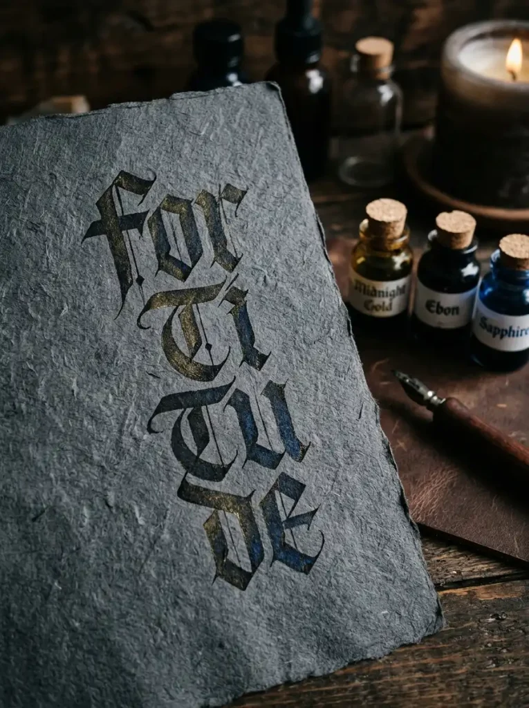
11. Gothic Letter Style
Gothic lettering features bold, angular letters with dramatic thick strokes and sharp edges. This dramatic style suits poster titles, edgy journal covers, and statement art pieces. It carries a strong, historical feel reminiscent of medieval manuscripts.
Start by practicing straight, angular strokes rather than curves. Use a broad-tip marker or calligraphy pen to naturally create the thick, blocky lines this style requires. Keep your letters tall and narrow for an authentic gothic appearance.
Avoid rounding your corners, since gothic letters rely on sharp angles for their signature look. Practice consistent letter width throughout each word. Personalize gothic lettering with metallic pens or dark, moody color palettes that match its dramatic tone.
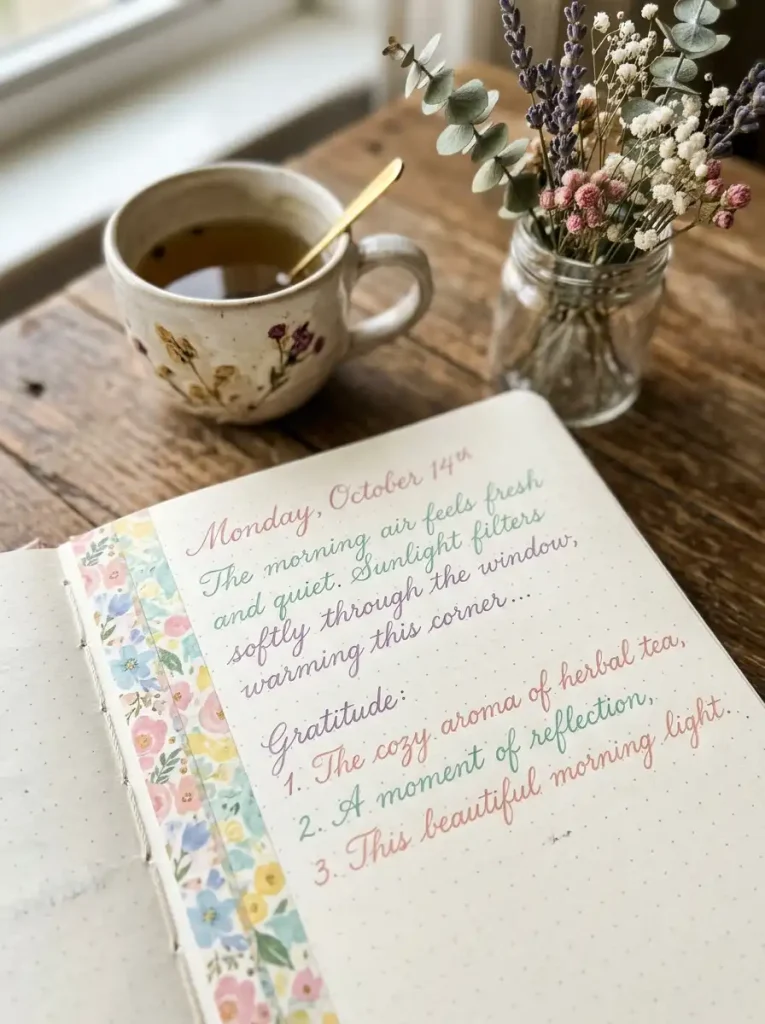
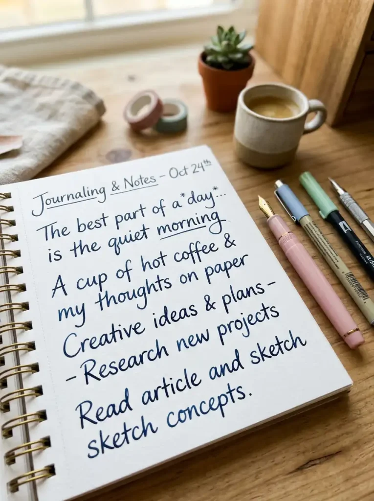
12. Aesthetic Journal Writing
Aesthetic journal writing blends neat handwriting with soft styling choices like consistent slant, spacing, and color coordination. It’s ideal for daily journaling, gratitude pages, and reflective writing spreads. This style focuses on creating a calming, visually pleasing page overall.
Begin with a comfortable, natural handwriting style, then refine consistency in letter height and spacing. Choose two or three coordinating pen colors to use throughout your entry. Soft gel pens or fine brush pens work beautifully for this relaxed, polished look.
Avoid switching handwriting styles mid-entry, since this disrupts visual flow. Stick to one consistent style per page. Personalize aesthetic journaling with washi tape borders, subtle highlights, or a signature color palette that reflects your personality.
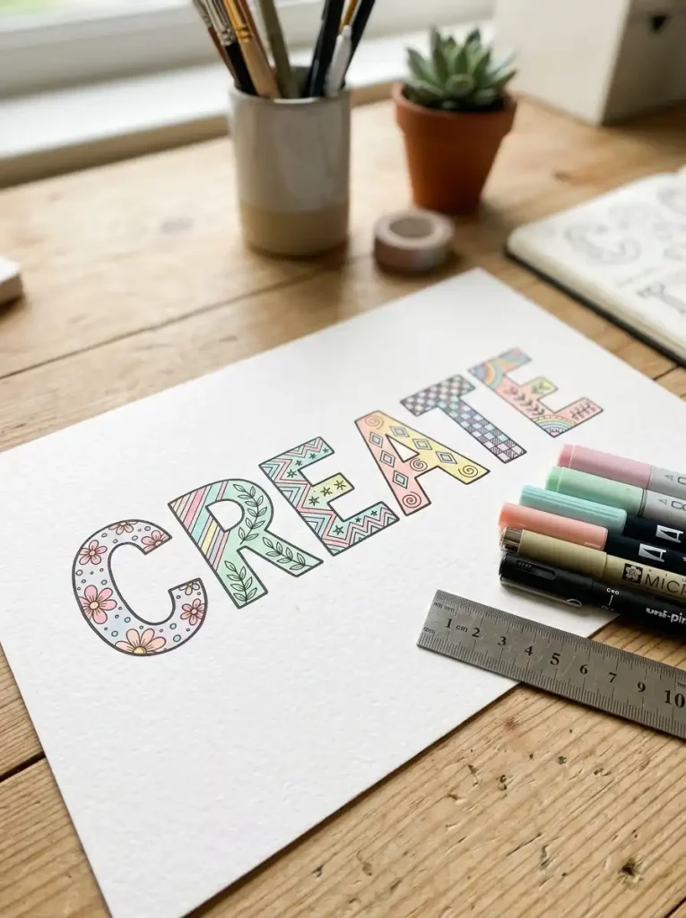
13. Decorative Block Letters
Decorative block letters combine bold, structured shapes with added patterns or textures inside each letter. This eye-catching style works well for titles, banners, and scrapbook pages. It’s sturdy and easy to read while still feeling creative and fun.
Start by drawing simple block letter outlines in pencil, then trace with a fineliner. Fill the inside of each letter with patterns like stripes, dots, or cross-hatching. Fine markers and gel pens give you the precision needed for clean pattern details.
Avoid making patterns too busy across every single letter. Instead, vary your patterns for visual interest and balance. Personalize decorative block letters with your favorite color schemes or textures inspired by nature, geometry, or seasonal themes.
14. Mixed Font Handwriting
Mixed font handwriting combines two or more lettering styles within a single word or sentence, such as pairing cursive with print or bubble letters with monoline. This versatile style adds visual interest to planner headers, quote pages, and creative titles.
Start by choosing one primary style for most letters, then swap in a contrasting style for emphasis on a specific word or letter. Practice each style separately first before combining them together. A mix of fineliners and brush pens gives you flexibility to switch between styles smoothly.
Avoid mixing too many styles at once, since this creates visual chaos. Limit yourself to two contrasting styles per composition. Personalize mixed font handwriting by using one style for emphasis words and another for the surrounding text.
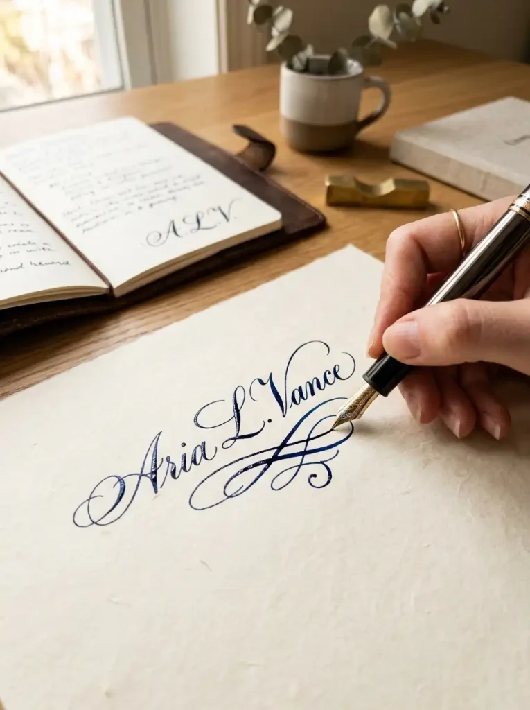
15. Personalized Signature Style
A personalized signature style is your own unique handwriting flair, developed by blending elements from several styles you enjoy. It works everywhere, from personal letters to professional signatures and creative branding. This style represents your individual identity on paper.
Start by identifying which letterforms and details you’re naturally drawn to, whether that’s rounded bubble shapes or elegant script loops. Combine your favorite elements gradually through consistent daily practice. Any pen you feel comfortable with works well here, since this style is entirely personal.
Avoid copying someone else’s handwriting exactly, since authenticity matters most in this style. Instead, borrow small details and adapt them naturally. Personalize your signature style further by refining it slowly over weeks and months until it feels effortless.
Comparison Table of Handwriting Styles
| Style | Difficulty | Best For | Tools Needed | Beginner Friendly |
|---|---|---|---|---|
| Modern Calligraphy | Moderate | Quotes, invitations | Brush pen | Yes |
| Bubble Letters | Easy | Titles, doodles | Marker, fineliner | Yes |
| Minimalist Print | Easy | Planners, notes | Fineliner | Yes |
| Vintage Script | Hard | Journals, art | Fountain pen | No |
| Brush Pen Lettering | Moderate | Quotes, titles | Brush pen | Yes |
| Doodle Lettering | Easy | Journals, covers | Fineliner, gel pen | Yes |
| Floral Letters | Hard | Cards, decor | Brush, watercolor | No |
| Rainbow Gradient | Moderate | Bullet journals | Blending markers | Yes |
| Shadow Lettering | Moderate | Headers, posters | Fineliner, marker | Yes |
| Monoline Handwriting | Easy | Planners, notes | Fineliner, gel pen | Yes |
| Gothic Lettering | Hard | Posters, art | Broad marker | No |
| Aesthetic Journaling | Easy | Daily journaling | Gel pen | Yes |
| Decorative Blocks | Moderate | Banners, scrapbooks | Fineliner, marker | Yes |
| Mixed Fonts | Moderate | Titles, quotes | Multiple pens | Yes |
| Signature Style | Easy | Personal use | Any pen | Yes |
Essential Supplies for Creative Handwriting
Choosing the right tools makes a noticeable difference in your handwriting results. Fountain pens work beautifully for vintage script and elegant signature styles, since they naturally vary line thickness. Fineliners offer precision, making them perfect for minimalist print, monoline writing, and detailed outlines.
Brush pens are essential for modern calligraphy and brush lettering, thanks to their flexible tips. Gel pens glide smoothly across paper and suit aesthetic journaling and decorative details. Markers, especially dual-tip varieties, work well for bubble letters, shadow lettering, and gradient effects.
A premium notebook with thick, quality paper prevents ink bleed and feels more satisfying to write on. Smooth paper especially benefits brush pen and calligraphy practice. Keep a ruler on hand for straight guidelines, along with a pencil and eraser for sketching letters before inking them permanently.
See also: 15 Fun Classroom Activities That Boost Student Engagement
How to Improve Your Handwriting Faster
Improving your handwriting comes down to consistent, focused practice rather than natural talent alone. Start each session with proper posture, sitting upright with your paper angled slightly for comfort. Hold your pen with a relaxed grip, since tension slows down your strokes and tires your hand quickly.
Practice basic strokes daily, including straight lines, curves, and loops, before moving into full letters. Focus on consistent spacing between letters and words, since uneven spacing makes handwriting look messy regardless of letterform quality. Try writing the same word slowly, then gradually increase your speed while maintaining that consistency.
A quick daily exercise involves writing the alphabet twice, once slowly and precisely, then once at your normal speed. Compare the two versions to spot where consistency breaks down. Common mistakes include rushing letters, pressing too hard, and ignoring proper spacing, so slow down whenever your writing starts feeling sloppy.
Pro tip: practice for just ten minutes daily rather than one long session weekly. Short, frequent practice builds muscle memory far more effectively than occasional long sessions.
Frequently Asked Questions
What is the easiest handwriting style to learn?
Minimalist print and monoline handwriting are generally the easiest styles for beginners. Both rely on simple, consistent strokes without dramatic pressure changes or complicated flourishes. Since they use basic fineliners or gel pens, there’s little learning curve involved with tools either. Most people can develop a neat version of these styles within a few practice sessions.
How can I improve my handwriting quickly?
Practice short daily sessions focused on consistent letter height, spacing, and slant. Slowing down while writing typically produces the fastest visible improvement. Tracing alphabets and repeating the same words several times also helps build muscle memory quickly. Consistency matters more than long, infrequent practice sessions.
What pens are best for beautiful handwriting?
Fountain pens and brush pens generally produce the most beautiful results, since they naturally create thick and thin line variation. Fineliners work well for cleaner, more structured styles like minimalist print. Ultimately, the best pen depends on which handwriting style you’re practicing and how comfortable it feels in your hand.
Can adults improve handwriting?
Yes, adults can absolutely improve their handwriting with consistent practice. Handwriting is a motor skill, meaning it responds well to repetition at any age. Many adults notice significant improvement within just a few weeks of daily short practice sessions using proper tools and techniques.
Is calligraphy the same as handwriting?
Calligraphy and handwriting are related but distinct. Handwriting refers to your natural, everyday writing style, while calligraphy involves deliberate, artistic lettering techniques following specific stroke rules. Modern calligraphy blends both, allowing more personal flair than traditional calligraphy while still following foundational stroke principles.
Which handwriting style is best for journaling?
Aesthetic journal writing and minimalist print work particularly well for journaling, since both prioritize readability alongside visual appeal. These styles allow you to write quickly while still maintaining a polished, pleasant look. Many journalers also mix in doodle lettering for headers and decorative touches.
How often should I practice handwriting?
Practicing for ten to fifteen minutes daily produces better results than occasional long sessions. Consistency helps build muscle memory faster than sporadic practice. Even short, focused sessions several times a week can noticeably improve your handwriting within a month.
What paper is best for handwriting practice?
Smooth, thick paper works best for most handwriting styles, especially when using fountain pens or brush pens that can bleed through thinner sheets. Dot grid or lightly lined paper helps maintain consistent letter height without feeling overly restrictive. Premium notebooks designed for lettering practice are worth the investment for serious practice.
Final Thoughts on Exploring New Handwriting Styles
Handwriting is a skill anyone can develop with patience and consistent practice. From bold gothic letters to soft aesthetic journaling, each style offers a different way to express yourself on paper. Trying new techniques keeps practice enjoyable while steadily building your overall skill and confidence.
Pick one idea from this list that excites you and give it a try today. Bookmark this guide for future inspiration, share it with a friend who loves lettering, and watch your handwriting transform one practice session at a time.