
10 Handwriting Ideas for Alphabets to Try
Learning more than one way to write the alphabet does wonders for your handwriting overall. Each style trains your hand to move differently, which builds better muscle memory and letter control. Over time, this variety also strengthens memory retention, since your brain processes letterforms in multiple ways.
Beyond the practical benefits, experimenting with alphabet styles simply feels rewarding. It turns a basic skill into a creative outlet you can use for journals, school projects, or handmade cards. Below are ten alphabet handwriting ideas worth practicing, along with tips to help each style actually stick.
1. Modern Calligraphy Alphabet
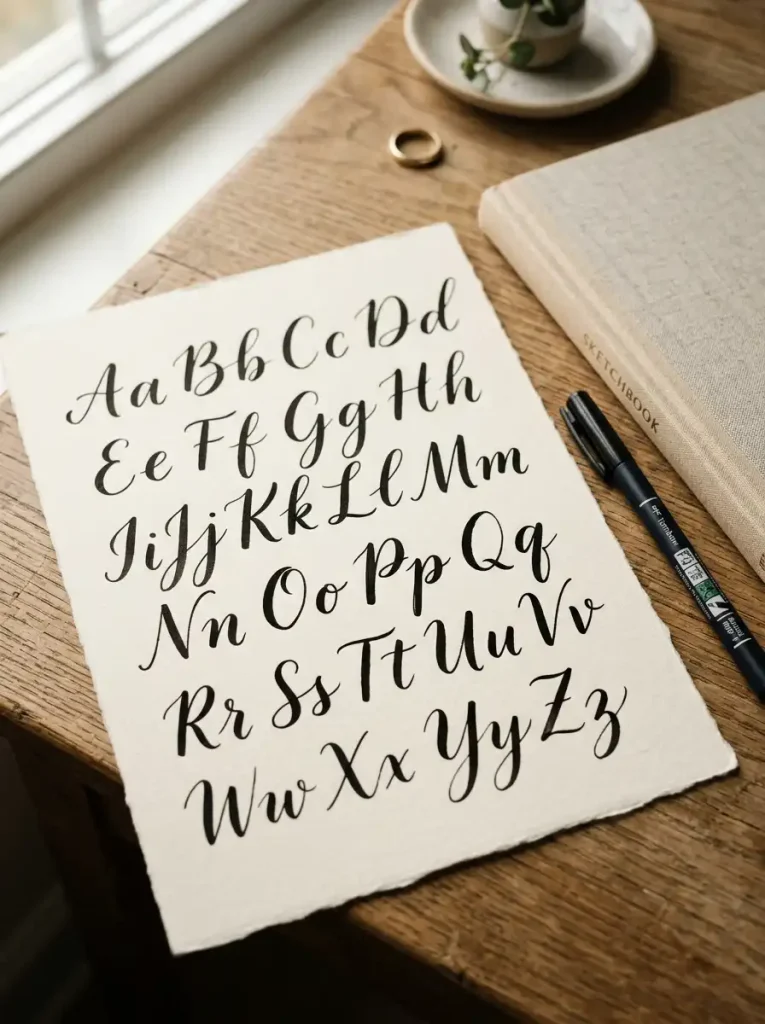
Modern calligraphy alphabets combine elegant thick-thin contrast with relaxed, personal spacing. Unlike traditional calligraphy, letters don’t need to be perfectly uniform, which makes this style approachable for beginners. It works beautifully for quote pages, invitations, and journal titles.
Each letter should feature thin upstrokes and thick downstrokes, creating natural contrast throughout the word. Curved letters like a, o, and e benefit most from this pressure variation. Straight letters like l and t stay simpler but still carry a graceful slant.
Beginners should practice basic strokes before attempting full letters. A flexible brush pen or a dual-tip marker works well for controlling pressure changes. Smooth, thick paper prevents ink from bleeding through during longer practice sessions.
Alphabet Example
Modern Calligraphy Alphabet
Uppercase: A B C D E F G H I J K L M N O P Q R S T U V W X Y Z
Lowercase: a b c d e f g h i j k l m n o p q r s t u v w x y z
In this style, every downstroke should feel noticeably thicker than each upstroke. Rounded letters carry gentle curves rather than sharp angles. Keep a consistent slant across the entire alphabet for a cohesive, polished look.
2. Bubble Letter Alphabet
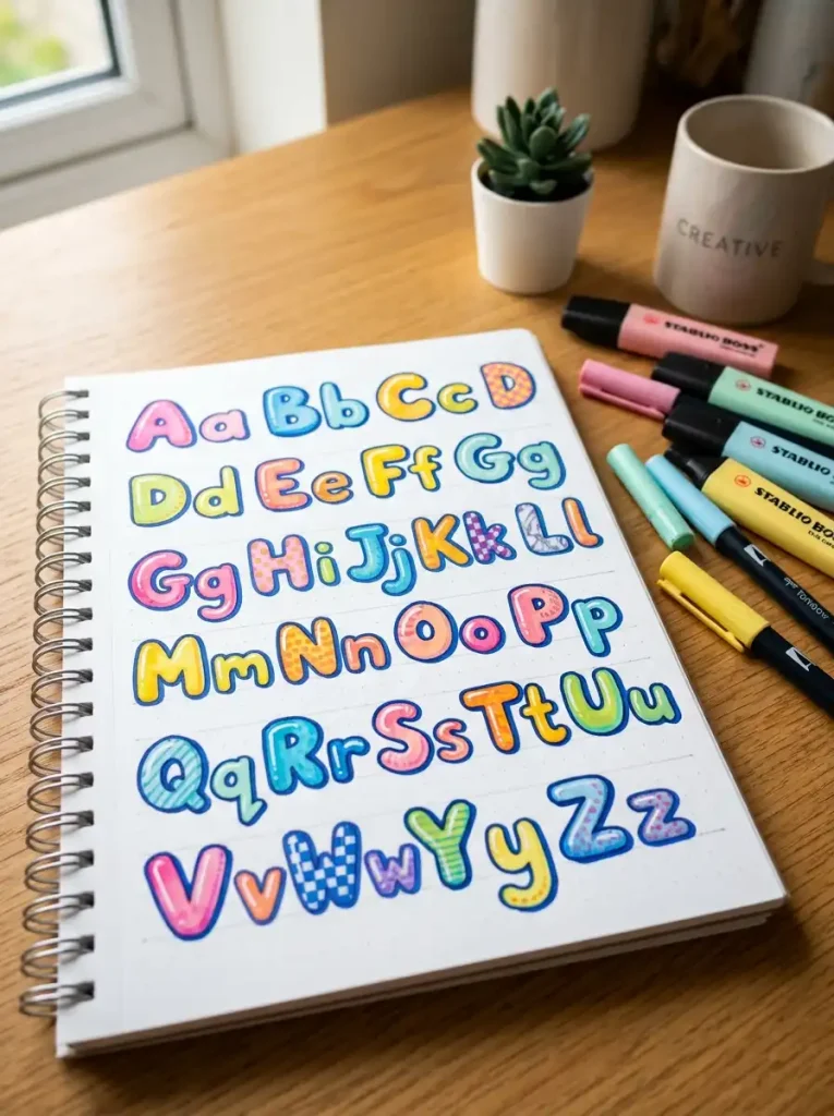
Bubble letter alphabets feature rounded, puffy shapes that feel playful and approachable. This style works well for posters, scrapbook titles, and doodle-style notebook covers. Because the letters are large and simple, they’re also easy for kids and beginners to learn quickly.
Each letter should look inflated, almost like a balloon shape. Straight letters like E or F round out at every corner instead of staying sharp. Circular letters like O or C become extra plump and rounded compared to standard print.
Start by sketching your letters lightly in pencil before tracing with a marker. Fineliners work for outlines, while broader markers help fill in the puffy centers. Keep your paper smooth, since rougher textures can make clean outlines harder to achieve.
A frequent mistake is drawing letters too thin, which removes the bubbly effect entirely. Keep outlines thick and consistent across every letter. Personalize your bubble alphabet with polka dots, stripes, or shading inside each rounded shape for extra visual interest.
Alphabet Example
Bubble Letter Alphabet
Uppercase: A B C D E F G H I J K L M N O P Q R S T U V W X Y Z
Lowercase: a b c d e f g h i j k l m n o p q r s t u v w x y z
Every corner across this alphabet should curve gently rather than come to a point. Keep letter width consistent so the whole set feels balanced. Rounded, puffy shapes should dominate even the naturally angular letters.
3. Block Letter Alphabet
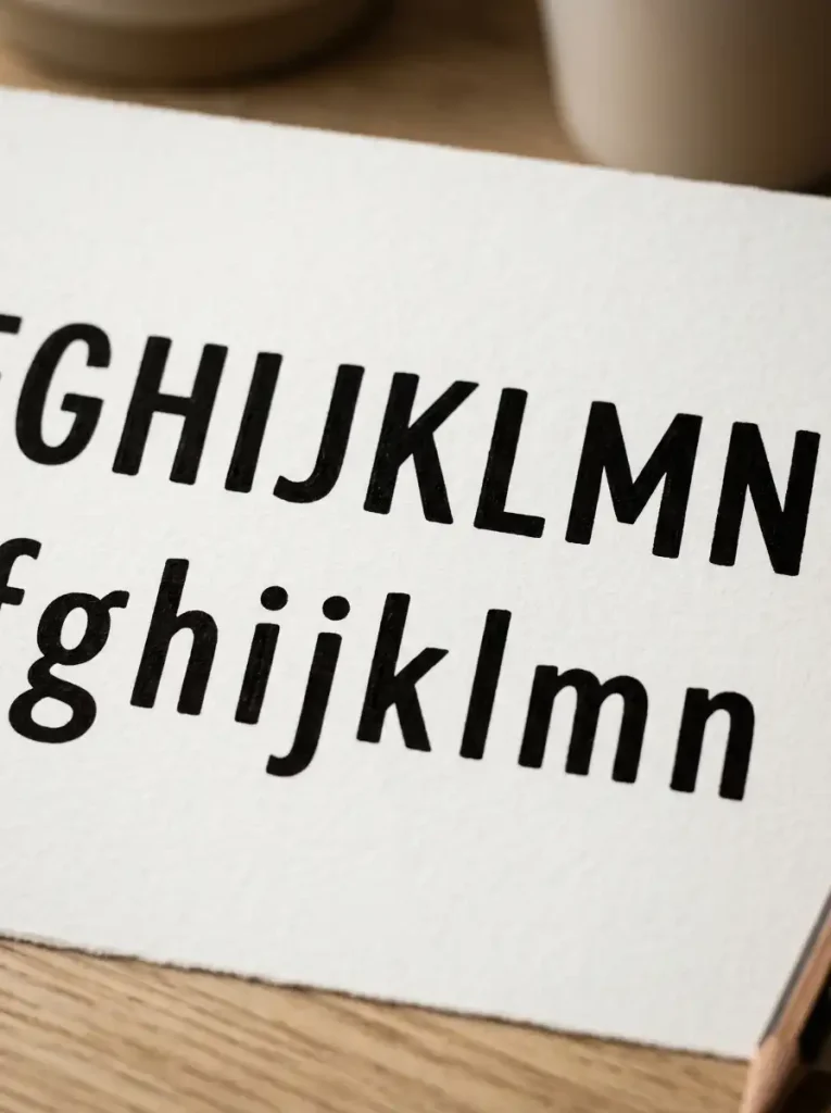
Block letter alphabets use bold, structured shapes with straight lines and sharp corners. This style suits headers, signage, and any project needing strong visual clarity. Because the letters are simple, they’re also one of the easiest styles for absolute beginners.
Every letter should maintain consistent width and height throughout the alphabet. Straight letters like H, T, and L stay perfectly geometric with no curves. Rounded letters like O and S simplify their curves into cleaner, more structured shapes.
Practice drawing straight guidelines first, since consistency matters most in this style. A ruler helps keep letter height uniform across an entire word or sentence. Fineliners or gel pens with a medium tip work well for crisp, clean block outlines.
A common mistake is letting letter width vary too much from one character to the next. Measure spacing carefully as you practice each row. Personalize block letters with patterns inside, like stripes or cross-hatching, for a decorative yet structured finish.
Alphabet Example
Block Letter Alphabet
Uppercase: A B C D E F G H I J K L M N O P Q R S T U V W X Y Z
Lowercase: a b c d e f g h i j k l m n o p q r s t u v w x y z
Keep every stroke straight and evenly weighted throughout this alphabet. Corners should stay sharp rather than rounded. Letter height and width should match closely across the full set for a clean, structured appearance.
4. Brush Letter Alphabet
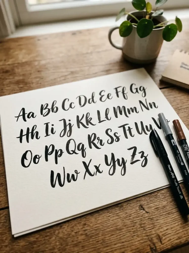
Brush letter alphabets rely on flexible-tip pens to create dramatic thick and thin strokes within each letter. This bold, expressive style works beautifully for quote art, journal titles, and greeting cards. It carries more movement and energy than standard print or calligraphy.
Downstrokes should feel noticeably thick, while upstrokes stay thin and light. Curved letters like a, e, and s show off this contrast especially well. Straight letters like i, l, and t keep things simple but still carry graceful taper at the ends.
Beginners should practice pressure control using basic strokes before forming full letters. Press down firmly on the way down, then lift pressure on the way up. Brush pens with soft, flexible tips give beginners the most predictable control during early practice.
A common mistake is applying even pressure throughout, which flattens the contrast completely. Focus on smooth, gradual pressure transitions instead of sudden changes. Personalize your brush alphabet by blending two pen colors together within a single word for a soft gradient effect.
Alphabet Example
Brush Letter Alphabet
Uppercase: A B C D E F G H I J K L M N O P Q R S T U V W X Y Z
Lowercase: a b c d e f g h i j k l m n o p q r s t u v w x y z
Every downstroke throughout this alphabet should appear thicker than its neighboring upstroke. Letters should feel fluid, almost like they’re flowing into one another. Keep a steady rhythm across the whole set for smooth, consistent contrast.
5. Monoline Alphabet
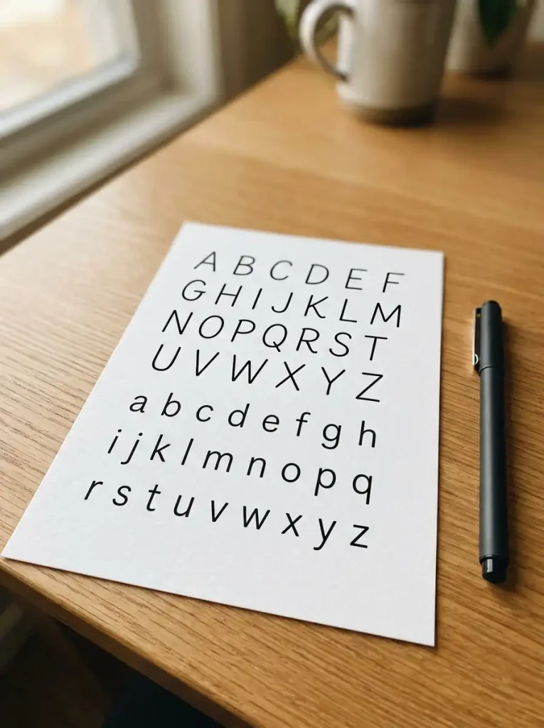
Monoline alphabets keep every stroke the same width from start to finish, creating a clean and consistent look. This style suits planners, professional notes, and modern lettering art. It feels calm and orderly, which makes it easy to read at a glance.
Letters should show absolutely no thick or thin variation anywhere in the alphabet. Curved letters like c, o, and g keep smooth, even lines throughout their shape. Straight letters like i, l, and t stay simple with no taper at either end.
A fineliner or gel pen with a fixed tip naturally supports this even, consistent style. Focus on steady hand movement rather than pressure control while practicing. Slow, deliberate strokes help beginners avoid accidentally creating thick and thin sections.
A frequent mistake is unconsciously varying pressure, which breaks the clean monoline effect. Keep your grip relaxed and your pace steady throughout each letter. Personalize this alphabet through spacing choices, subtle slants, or pairing it with small minimalist doodles.
Alphabet Example
Monoline Alphabet
Uppercase: A B C D E F G H I J K L M N O P Q R S T U V W X Y Z
Lowercase: a b c d e f g h i j k l m n o p q r s t u v w x y z
Every stroke across this alphabet should stay exactly the same thickness. Curves should flow smoothly without any bulges or thin spots. Consistency, more than decoration, defines the character of this entire style.
6. Vintage Script Alphabet
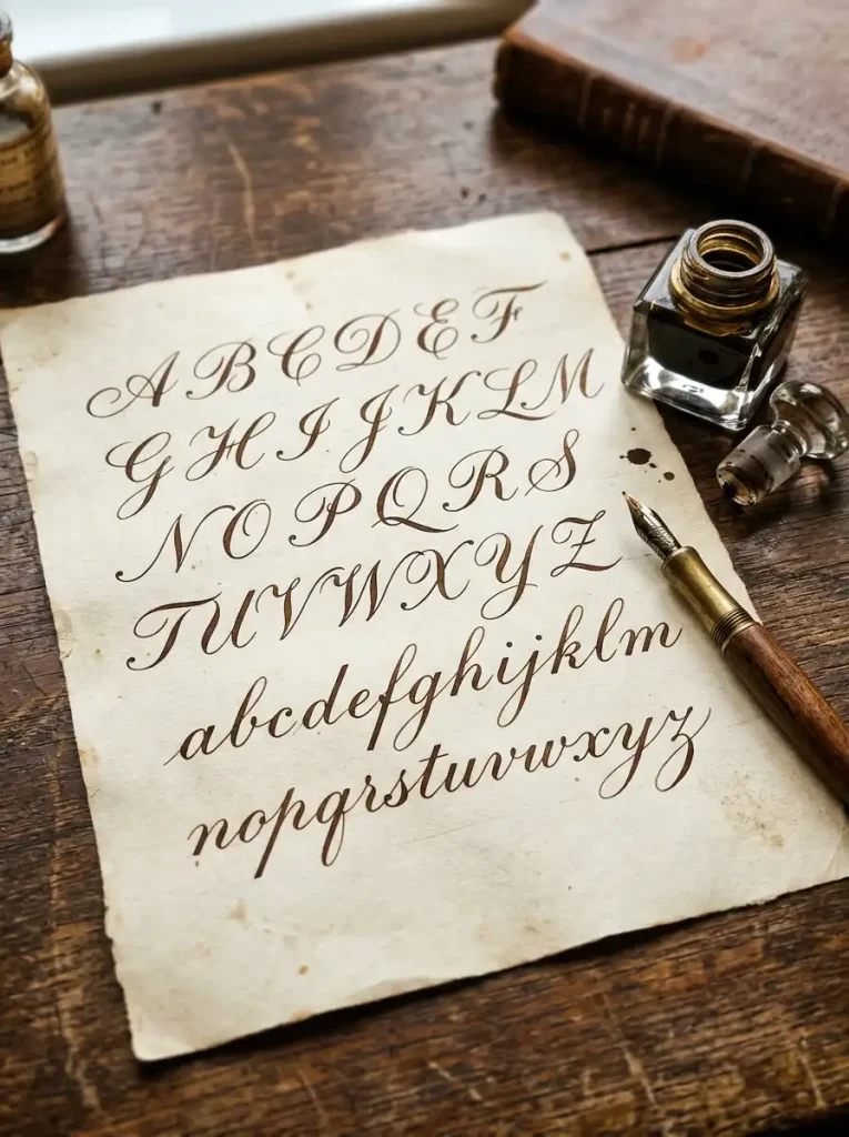
Vintage script alphabets mimic elegant, old-fashioned lettering found in historical letters and antique documents. This romantic style suits journal quotes, nostalgic art projects, and handwritten keepsakes. It carries a timeless charm that feels more personal than modern fonts.
Letters should connect smoothly with delicate loops and a consistent gentle slant. Tall letters like l, h, and b feature elegant upward loops, while descenders like g and y curl gracefully downward. Slight unevenness between letters actually adds authenticity to this style.
Study old script alphabets for inspiration before practicing your own version. A fountain pen with fine ink flow captures the slightly uneven, elegant character this style needs. Cream or aged-toned paper enhances the antique feeling even further.
A common mistake is making every letter perfectly uniform, which removes the vintage charm entirely. Allow natural variation between similar letters instead. Personalize vintage script with sepia ink, subtle ink blots, or a slightly heavier slant for extra character.
Alphabet Example
Vintage Script Alphabet
Uppercase: A B C D E F G H I J K L M N O P Q R S T U V W X Y Z
Lowercase: a b c d e f g h i j k l m n o p q r s t u v w x y z
Loops and connecting strokes should flow gently throughout this alphabet. Keep a consistent slant angle across every letter. Small variations between similar letters give this style its authentic, handwritten charm.
7. Gothic Alphabet
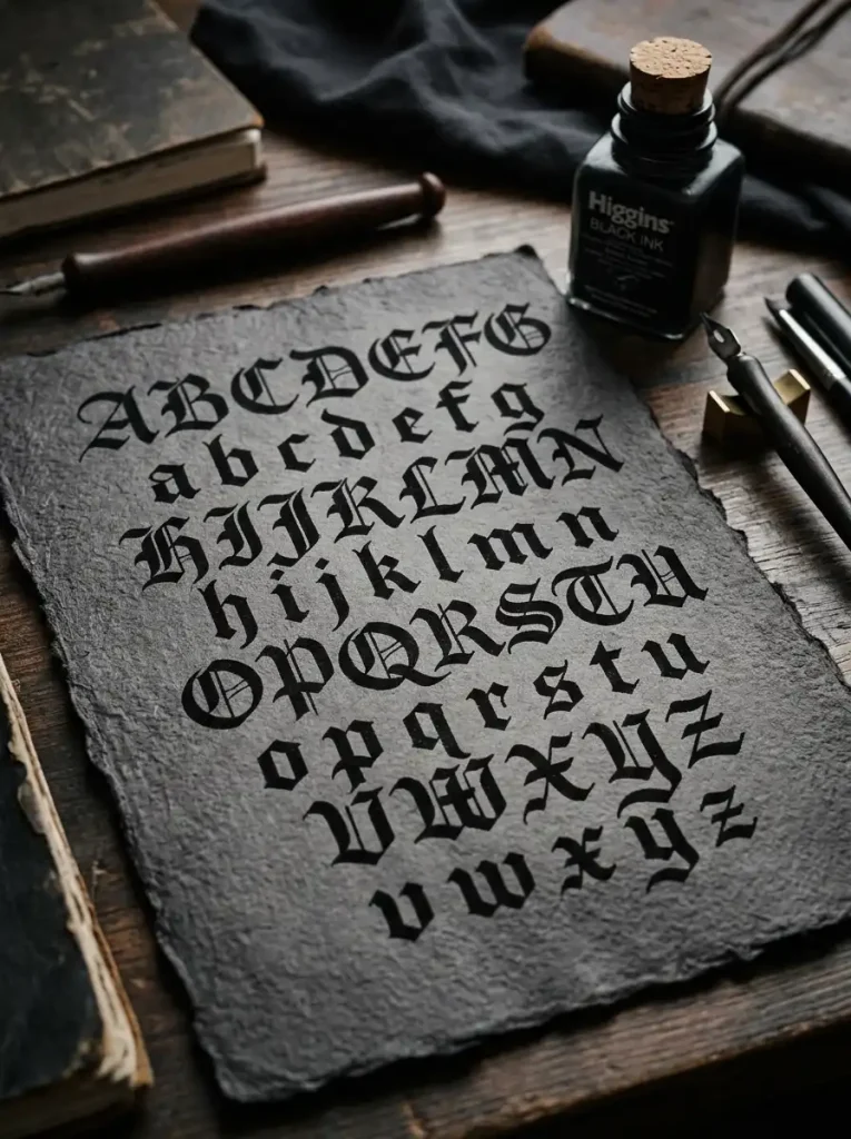
Gothic alphabets feature bold, angular letters with dramatic thick strokes and sharp edges. This dramatic style suits poster titles, statement art, and projects with a historical or edgy theme. It carries a strong visual presence reminiscent of medieval manuscripts.
Letters should stay tall, narrow, and heavily angular rather than rounded. Straight letters like M, N, and W feature sharp, dramatic points at every corner. Even naturally curved letters like O or C simplify into angular, diamond-like shapes in this style.
Practice straight, deliberate strokes rather than smooth curves while learning this alphabet. A broad-tip marker or calligraphy pen naturally creates the thick, blocky lines gothic lettering requires. Keep your letters narrow and consistently spaced for an authentic appearance.
A common mistake is rounding corners out of habit, which weakens the gothic look significantly. Focus on sharp angles throughout every letter you practice. Personalize gothic lettering with metallic pens or deep, moody color palettes that match its dramatic tone.
Alphabet Example
Gothic Alphabet
Uppercase: A B C D E F G H I J K L M N O P Q R S T U V W X Y Z
Lowercase: a b c d e f g h i j k l m n o p q r s t u v w x y z
Every letter across this alphabet should feel tall, narrow, and sharply angled. Corners stay pointed rather than curved throughout the set. Bold, heavy strokes give this style its dramatic, historical character.
8. Floral Decorative Alphabet
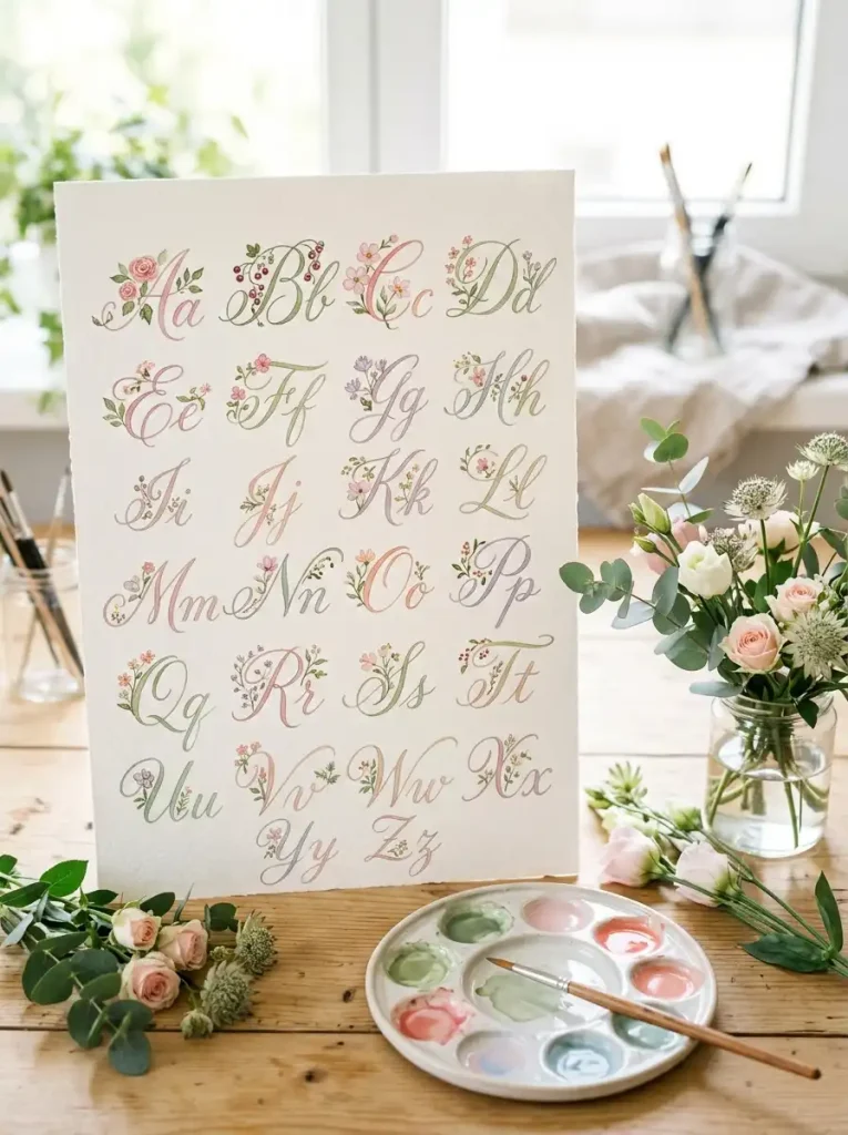
Floral decorative alphabets weave small flowers, vines, and leaves directly into letterforms. This romantic style works beautifully for greeting cards, wedding decor, and aesthetic journal spreads. It transforms plain letters into small, giftable pieces of art.
Each letter starts as a simple script or print shape, then gains decorative floral touches at key points. Tall letters like l, b, and h often grow small vines from their upward strokes. Rounded letters like o and e can feature tiny blossoms nestled inside their curves.
Begin with your base letter in pencil, then add floral details using a fine brush or watercolor marker. Practice drawing simple flowers and leaves separately before combining them with letters. Textured, slightly thick paper handles watercolor details without warping.
Avoid decorating every single letter, since this quickly becomes overwhelming and hard to read. Choose two or three letters per word for floral accents instead. Personalize this alphabet with seasonal flowers or a color palette matching a specific project or occasion.
Alphabet Example
Floral Decorative Alphabet
Uppercase: A B C D E F G H I J K L M N O P Q R S T U V W X Y Z
Lowercase: a b c d e f g h i j k l m n o p q r s t u v w x y z
Base letters throughout this alphabet stay simple, while small floral details accent select strokes. Vines often trail from ascenders, and blossoms tuck neatly into rounded curves. Balance matters more than covering every single letter.
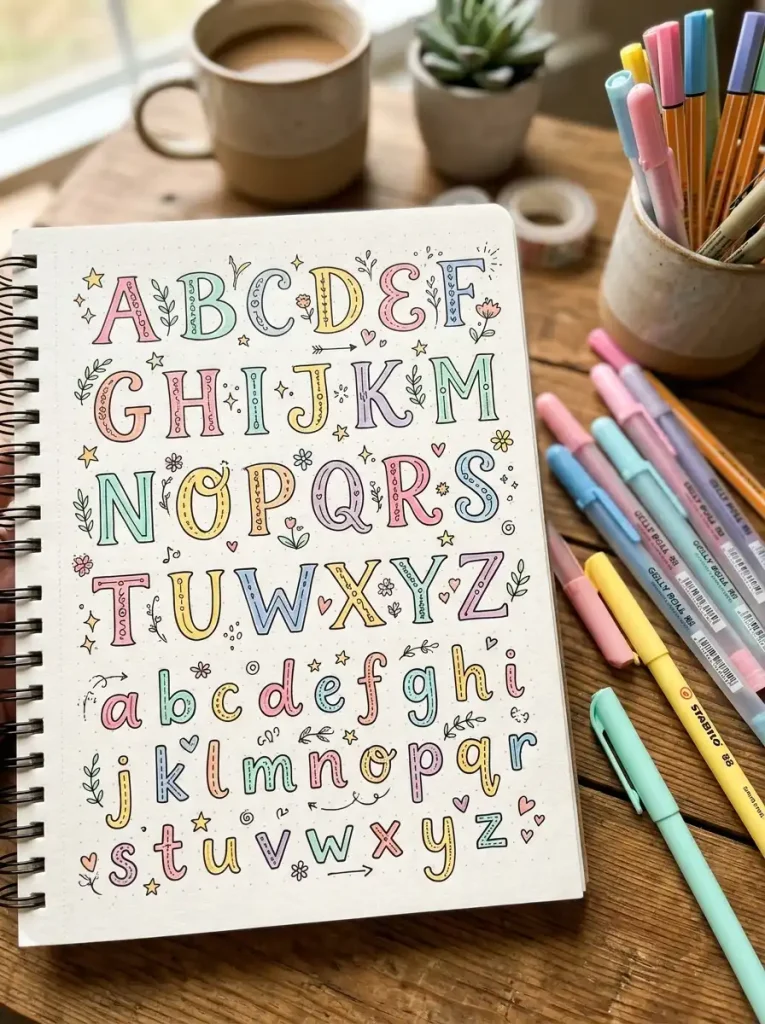
9. Doodle Alphabet
Doodle alphabets combine simple lettering with small illustrations tucked into or around each letter. This playful style suits journal covers, planner headers, and creative notebook pages. It turns the basic alphabet into a fun, personalized art project.
Each letter begins as a simple bubble or block shape, then gains small doodles like stars, hearts, or leaves nearby. Rounded letters like o and c work especially well as tiny faces or patterned shapes. Straight letters like l or t can double as stems for small doodle flowers.
Start with fineliners for clean outlines, then add color using gel pens or fine markers. Keep your doodles simple and small at first, since intricate details can overwhelm beginners quickly. Practice a few doodle elements separately before combining them with full letters.
A common mistake is decorating every letter identically, which makes the alphabet feel repetitive rather than playful. Vary your doodle choices across different letters instead. Personalize this alphabet with themes like seasons, animals, or hobbies that reflect your personal interests.
Alphabet Example
Doodle Alphabet
Uppercase: A B C D E F G H I J K L M N O P Q R S T U V W X Y Z
Lowercase: a b c d e f g h i j k l m n o p q r s t u v w x y z
Simple bubble or block letters form the base throughout this alphabet. Small doodles like stars, leaves, or dots accent select letters for variety. Playfulness, rather than uniformity, defines this creative style.
10. Mixed Font Alphabet
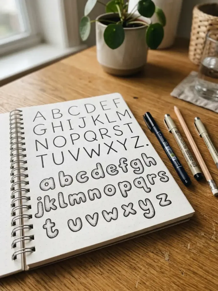
Mixed font alphabets combine two or more lettering styles within a single set, such as pairing bubble letters with monoline or script with block print. This versatile style adds visual interest to planner headers, quote pages, and creative titles.
Choose one primary style for most letters, then swap in a contrasting style for specific accent letters. For example, vowels might appear in bubble letters while consonants stay in clean monoline. This contrast draws the eye naturally toward key parts of a word.
Practice each individual style separately before attempting to combine them. A mix of fineliners and brush pens gives you the flexibility needed to switch styles smoothly within one alphabet. Keep spacing consistent so the mixed styles still feel cohesive together.
A common mistake is combining too many contrasting styles at once, which creates visual chaos. Limit yourself to two styles maximum per alphabet or word. Personalize mixed font lettering by using one style consistently for emphasis and another for supporting letters.
Alphabet Example
Mixed Font Alphabet
Uppercase: A B C D E F G H I J K L M N O P Q R S T U V W X Y Z
Lowercase: a b c d e f g h i j k l m n o p q r s t u v w x y z
Two contrasting styles alternate throughout this alphabet, such as bubble letters paired with monoline print. Spacing and sizing should stay consistent despite the style switch. Balance between the two styles keeps the whole alphabet readable.
Comparison Table of Alphabet Styles
| Alphabet Style | Difficulty | Best For | Recommended Pen | Beginner Friendly |
|---|---|---|---|---|
| Modern Calligraphy | Moderate | Quotes, titles | Brush pen | Yes |
| Bubble Letters | Easy | Posters, doodles | Marker | Yes |
| Block Letters | Easy | Headers, signage | Fineliner | Yes |
| Brush Letters | Moderate | Quote art, cards | Brush pen | Yes |
| Monoline | Easy | Planners, notes | Fineliner, gel pen | Yes |
| Vintage Script | Hard | Journals, keepsakes | Fountain pen | No |
| Gothic | Hard | Posters, statement art | Broad marker | No |
| Floral Decorative | Hard | Cards, decor | Brush, watercolor | No |
| Doodle | Easy | Journals, covers | Fineliner, gel pen | Yes |
| Mixed Font | Moderate | Titles, quotes | Multiple pens | Yes |
Essential Supplies for Alphabet Handwriting Practice
The right tools make every alphabet style noticeably easier to master. Brush pens are essential for modern calligraphy and brush lettering, since their flexible tips naturally create thick and thin contrast. Fountain pens work beautifully for vintage script, adding elegant line variation without much effort.
Fineliners offer precision, making them ideal for block letters, monoline writing, and clean doodle outlines. Gel pens glide smoothly and suit decorative details, doodle accents, and mixed font styles. Markers, especially broad or dual-tip varieties, work well for bubble letters and gothic lettering alike.
Keep pencils and erasers nearby for sketching letters before inking them permanently. Tracing paper helps beginners practice letterforms without committing to a final version right away. A ruler keeps block letters and monoline alphabets consistently sized and spaced.
Choose premium notebooks with smooth, thick paper to prevent ink bleed, especially when practicing brush or fountain pen styles. Smooth paper particularly benefits calligraphy and floral decorative work. Meanwhile, slightly textured paper can add character to vintage script practice.
How to Practice Alphabet Handwriting Every Day
Consistent daily practice matters far more than occasional long sessions. Start each practice session with basic stroke drills, including straight lines, curves, and loops. These simple movements build the muscle memory every alphabet style eventually depends on.
Practice individual letters before attempting full words or sentences. Focus on one letter at a time, repeating it five or six times in a row. This repetition helps you notice small inconsistencies in shape, slant, or spacing before they become habits.
Pay close attention to spacing between letters, since uneven gaps make even beautiful letterforms look messy. Keep your slant angle consistent throughout an entire alphabet or word. Pro tip: lightly draw guidelines before practicing to keep letter height uniform across the page.
Pressure control matters especially for calligraphy and brush lettering styles. Practice pressing down gently, then firmly, then gently again to feel the difference in your hand. Tracing printed alphabets is a great beginner exercise, since it builds familiarity with letter shapes before freehand attempts.
Once your letters feel steady, gradually increase your writing speed without sacrificing neatness. Write the same word slowly first, then again at a natural pace, and compare the two results. A quick daily exercise: write the full alphabet once slowly and precisely, then once at your normal speed, checking where consistency starts to slip.
Frequently Asked Questions
What is the easiest alphabet handwriting style?
Monoline and block letter alphabets are generally the easiest styles for beginners to learn. Both rely on simple, consistent strokes without dramatic pressure changes or complicated flourishes. Since they only require a basic fineliner or gel pen, there’s little learning curve involved with tools. Most beginners can develop a neat version of these styles within just a few practice sessions.
How can I make my alphabet writing look beautiful?
Focus on consistent letter height, spacing, and slant throughout your writing. Slowing down while forming each letter typically produces the most noticeable improvement. Practicing basic strokes before full letters also builds better control over time. Choosing a pen suited to your chosen style, such as a brush pen for calligraphy, makes a real difference too.
Which pens are best for alphabet lettering?
Fountain pens and brush pens generally produce the most elegant results, since they create natural thick and thin line variation. Fineliners work best for cleaner, more structured styles like block letters and monoline writing. Ultimately, your ideal pen depends on which alphabet style you’re practicing and how it feels in your hand.
Can adults improve alphabet handwriting?
Yes, adults can absolutely improve their alphabet handwriting with consistent practice. Handwriting is a motor skill, so it responds well to repetition regardless of age. Many adults notice real improvement within a few weeks of short, focused daily practice sessions using the right tools and techniques.
How long does it take to learn decorative alphabets?
Learning a decorative alphabet style, such as floral or gothic lettering, typically takes several weeks of regular practice. Simpler styles like bubble or block letters can feel comfortable within just a few days. Consistency matters more than natural talent, so daily short sessions speed up progress considerably.
What alphabet style is best for journals?
Monoline and doodle alphabets work particularly well for journaling, since both prioritize readability alongside visual charm. These styles allow you to write quickly while still keeping pages looking polished and personal. Many journalers also mix in modern calligraphy for titles or headers throughout their entries.
Should I practice uppercase or lowercase first?
Most beginners find it easier to start with uppercase letters, since their shapes tend to be simpler and more structured. Once uppercase feels comfortable, lowercase letters become easier to learn, since many share similar strokes. Practicing both together eventually helps build a more complete, natural handwriting style.
How often should I practice alphabet handwriting?
Practicing for ten to fifteen minutes daily produces noticeably better results than occasional long sessions. Consistency helps build muscle memory far faster than sporadic practice ever could. Even a few short sessions each week can meaningfully improve your alphabet handwriting within a month.
Final Thoughts on Exploring Alphabet Handwriting Styles
Learning multiple alphabet handwriting styles turns a basic skill into a genuinely creative hobby. From bold gothic letters to soft, decorative floral designs, each style offers a fresh way to express yourself through the same twenty-six letters. Practicing regularly keeps the process enjoyable while steadily building real skill and confidence.
Choose one alphabet style from this list that catches your eye and start practicing today. Save this guide for future inspiration, share it with someone who loves lettering, and watch your handwriting grow more beautiful with every practice session.